I worked with University College London (UCL) to design and build a new staff experience platform for managing HR and admin activities such as, booking leave or updating personal details.
As part of the project we created a component library and the foundations of a design system to support the new progressive web app and future applications.
Research
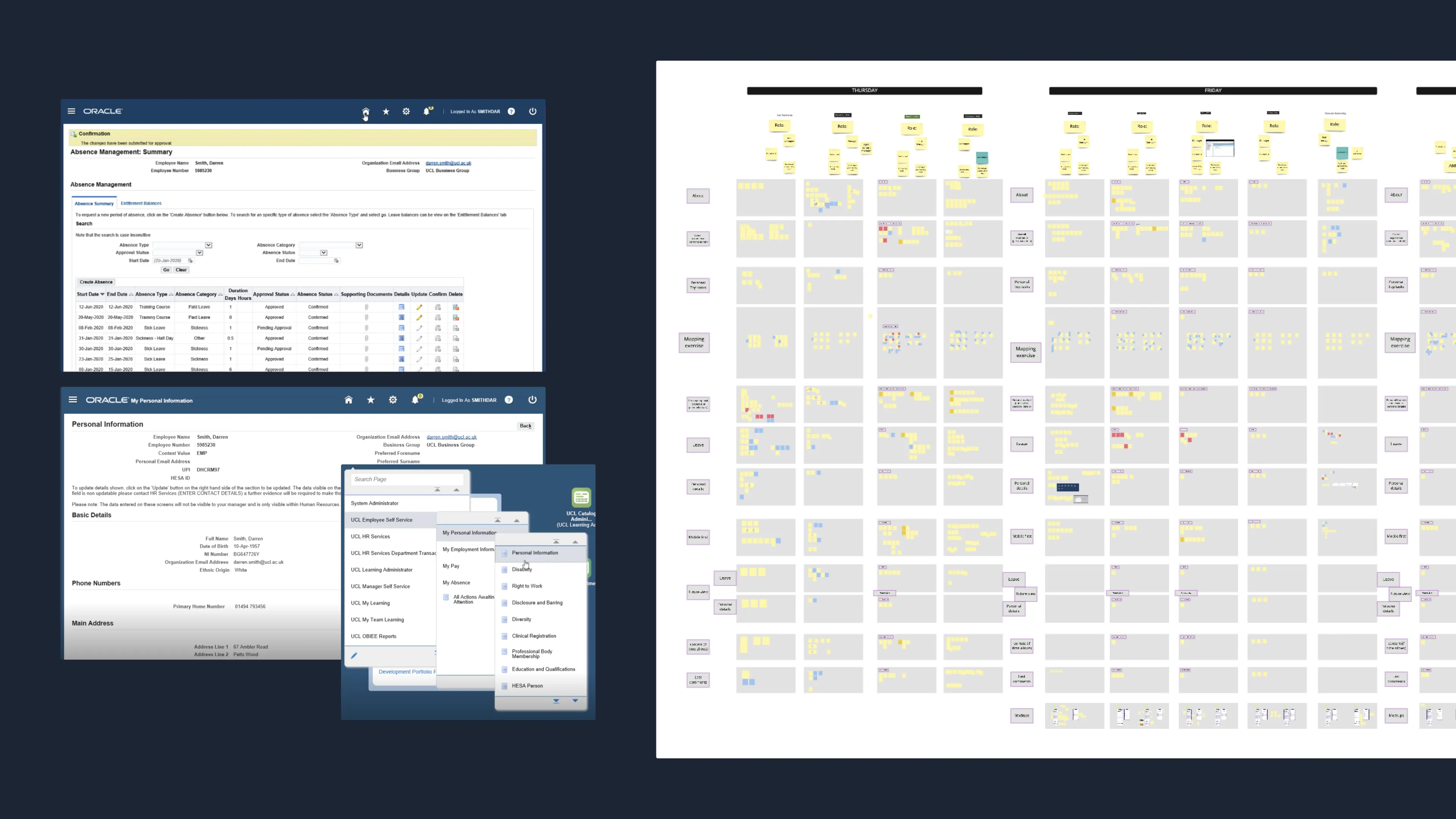
The project included three rounds of qualitative user testing for a total of eighteen in-depth interviews with staff members in various roles, such academic staff, researchers, professional staff, and new starters.
In the first round we explored the current system in-depth to understand its failings and the needs of different people in the business. The other two rounds focused on different iterations of the new staff experience on mobile and desktop.
Prototype
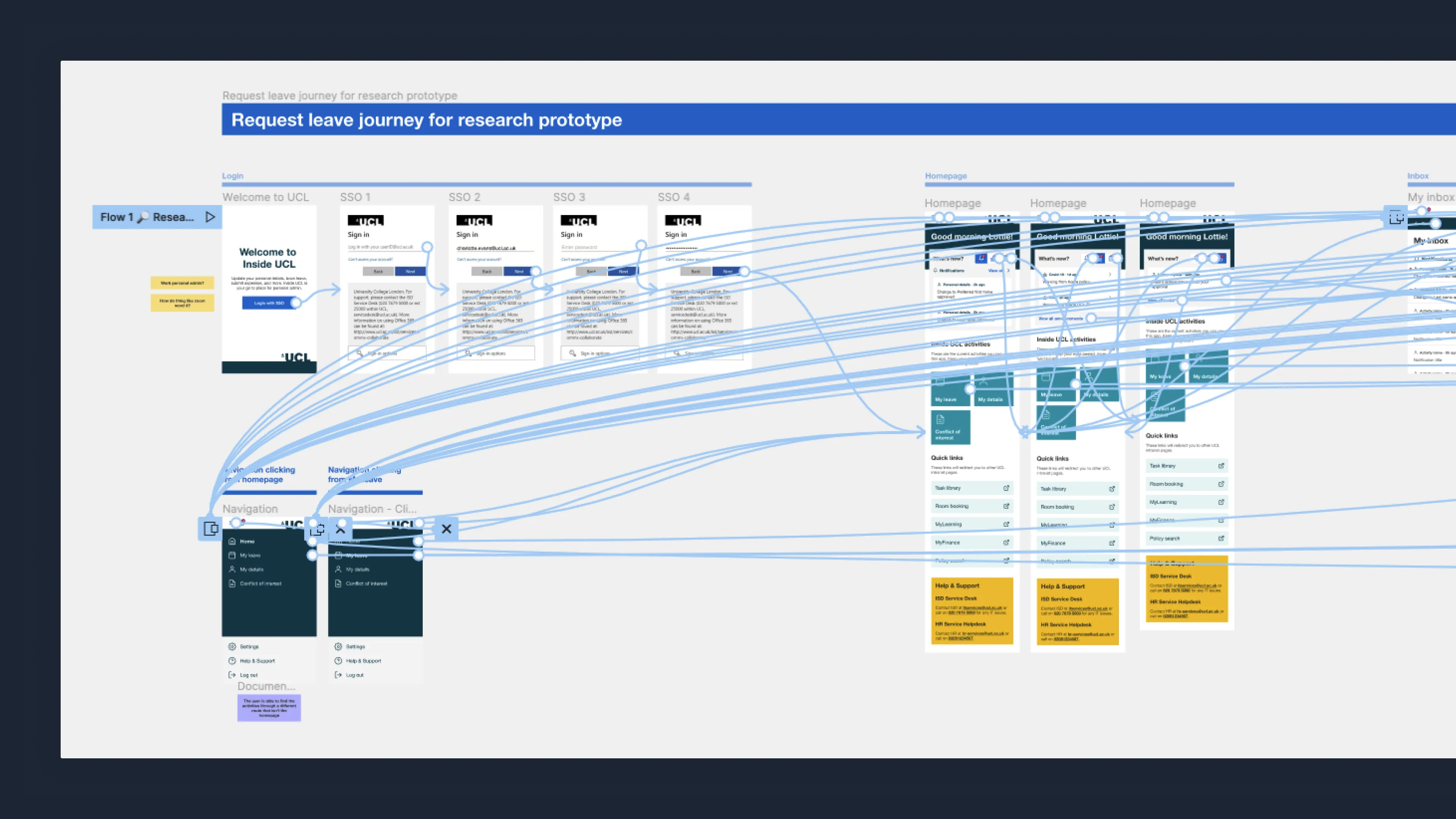
Using the insights from the research and stakeholder workshops we formed user journey flows for managing personal details and annual leave for both the person requesting and the approver.
We built several complex prototypes for user research to test and iterate on the flows we had created. The prototypes contained multiple routes to ensure the user could explore the new designs in a natural and realistic way.
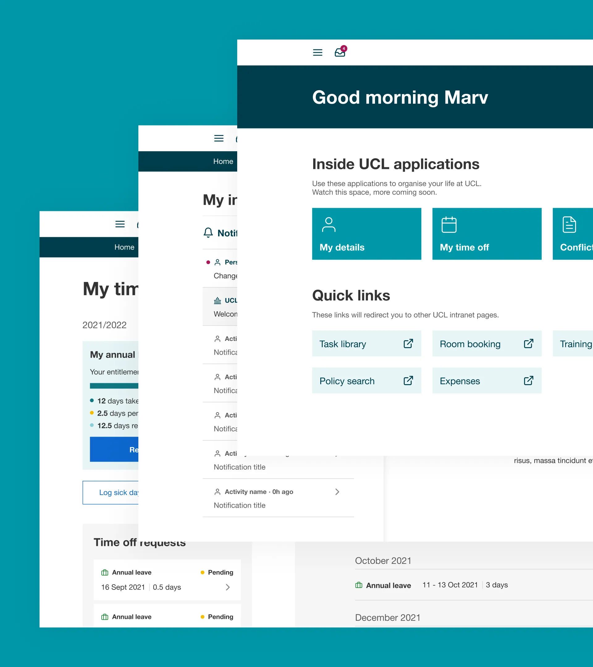
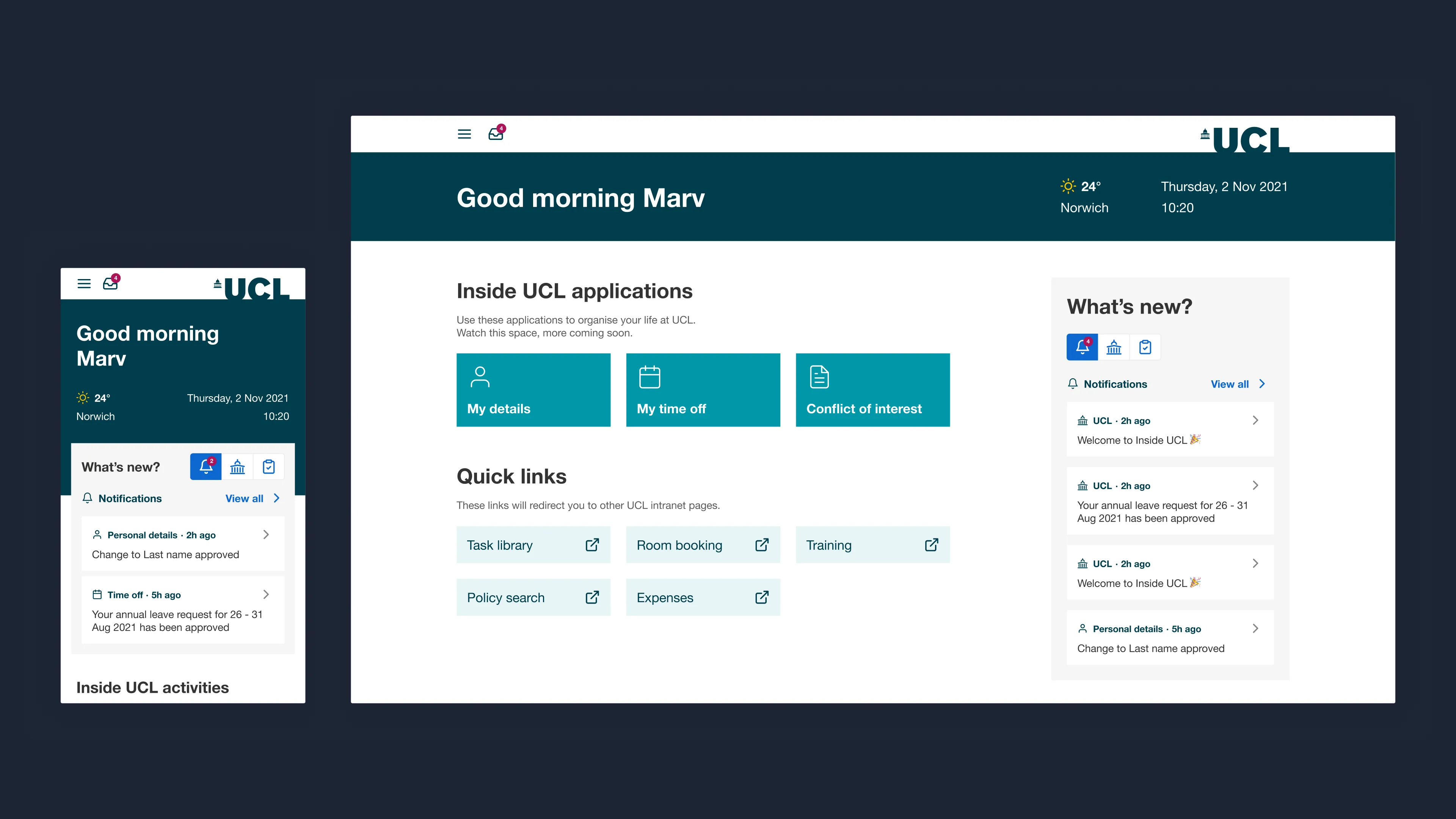
Dashboard
On the dashboard we focused on simplifying the information architecture of the current platform and making sure different areas of the application were clearly signposted. We also defined the different types of notifications.
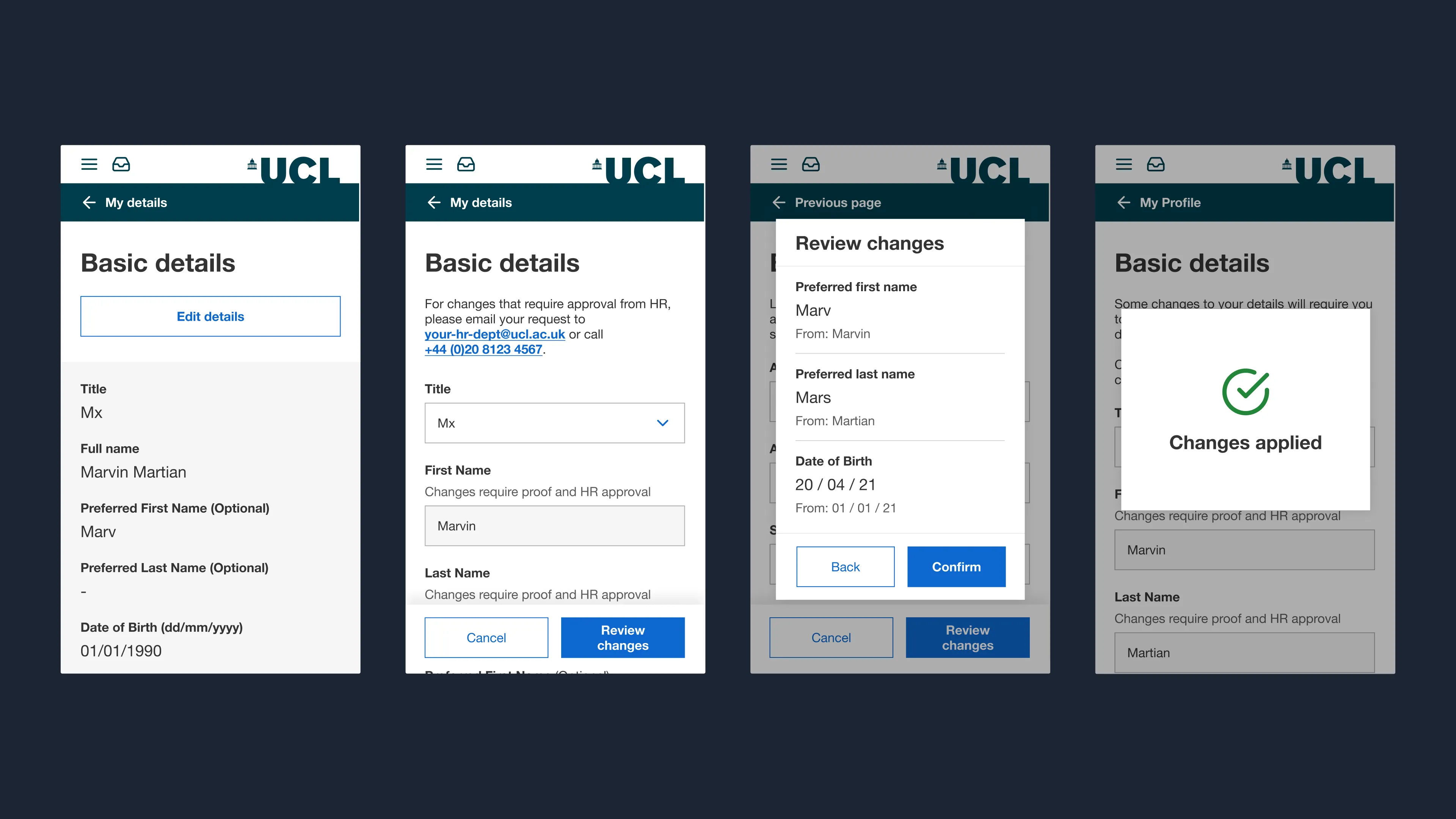
Basic details
During interviews for the current system, we found that often staff members weren’t confident that they had saved the changes they had made, or they were completely unaware that they hadn’t saved the changes.
We tackled this in the new designs by using different states of the form fields to distinguish viewing vs editing and providing a clear review step and saving confirmation.
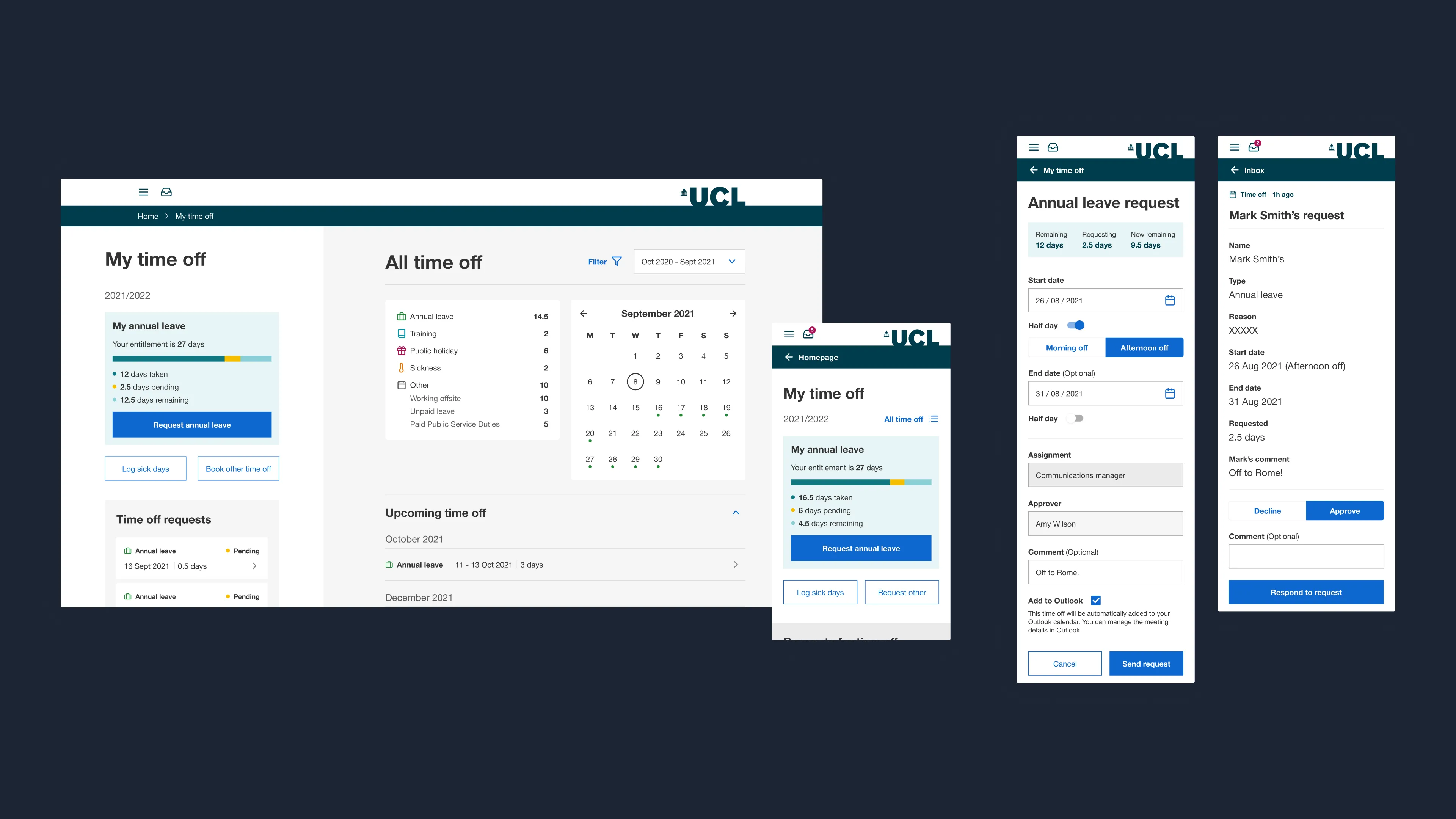
Time off
In this project we were focusing on annual leave, however planning for the future we structured the time off page to prioritise annual leave and sick leave as these were found to be the most common.
We ensured the user could see their time off before, during and after booking. We also refined the approval process for the manager to make sure they were seeing the information they needed and the system captured their response, such as requiring a comment when declining a request.
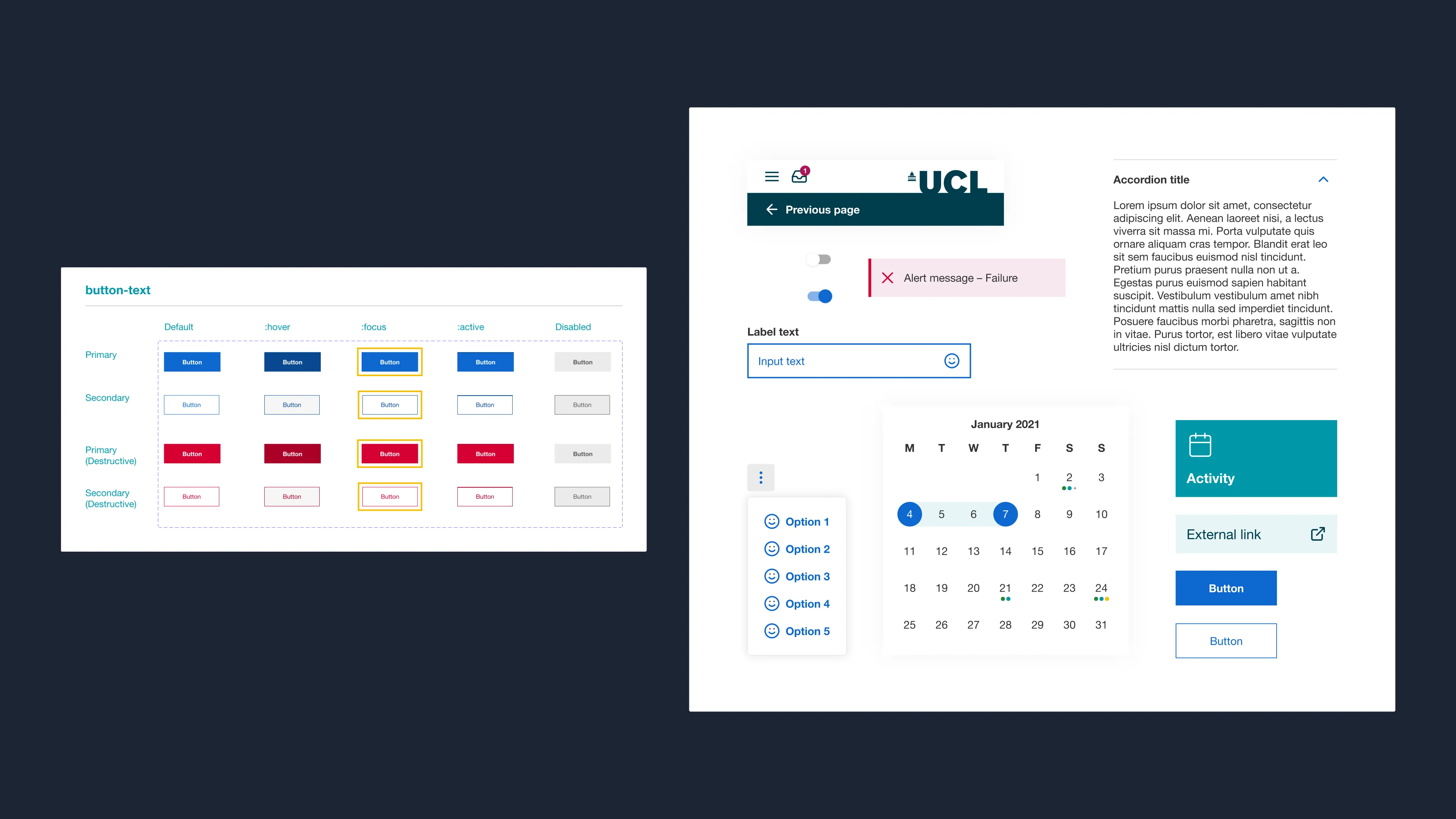
Component library
As part of the project, we built a component library and some foundations of a design system. We created highly flexible components, and using nesting we built complex properties into a single component whilst ensuring all the variants were easily maintainable.
By creating just fifteen flexible and efficient components, and defining set styles, we were able to create over one hundred responsive pages. This enabled a high amount of reuse in design and development speeding up both processes exponentially as more components were created.