When I started at the Raspberry Pi Foundation it quickly became evident that a lot of time and effort could be saved if all the products could share a set of patterns and components.
I’ve established foundational styles for spacing, typography and colours, unified several components across the Foundation’s products, and pushed for a design token approach that will ultimately help support several brand themes.
I now co-own the Design System within Raspberry Pi Foundation. I work closely with the developers on the project to make informed decisions about the system’s direction.
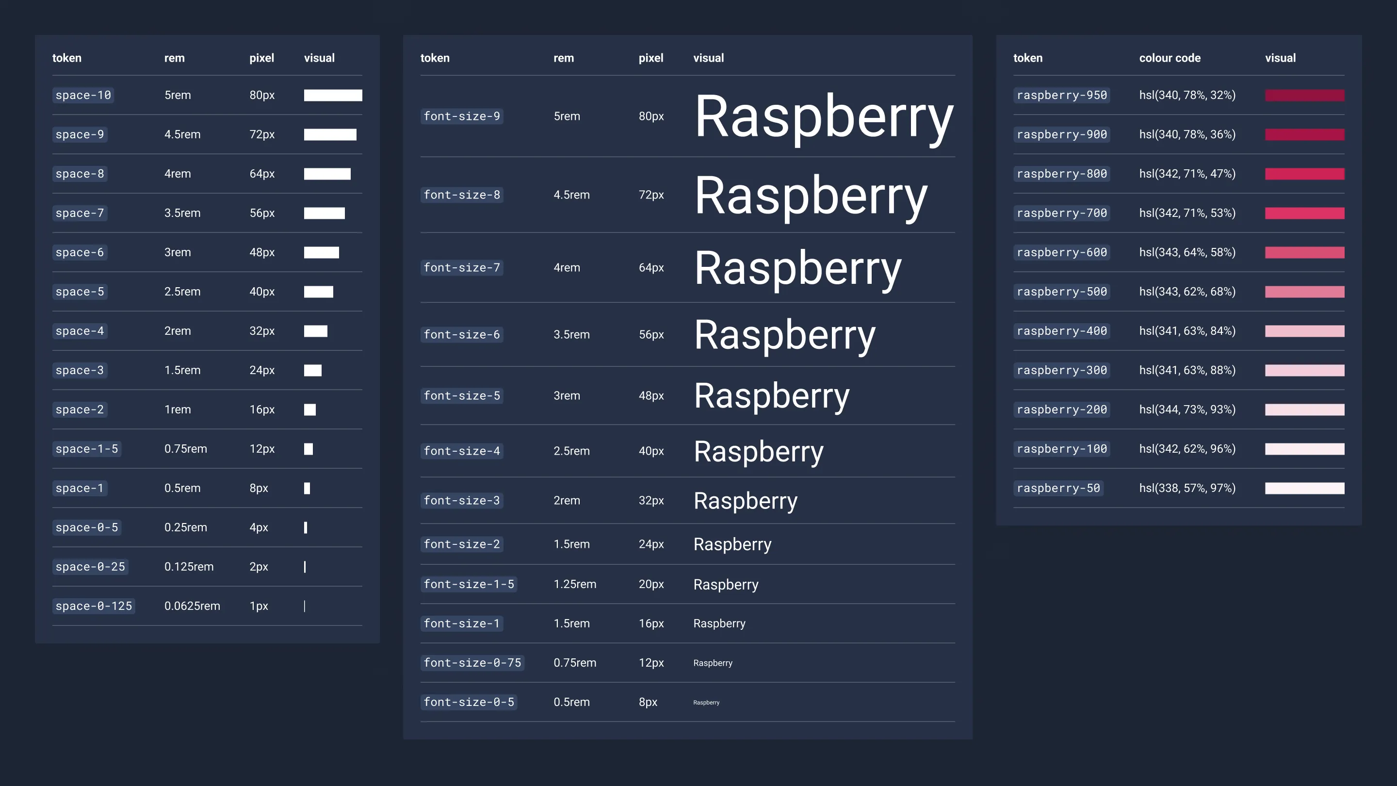
Foundational styles
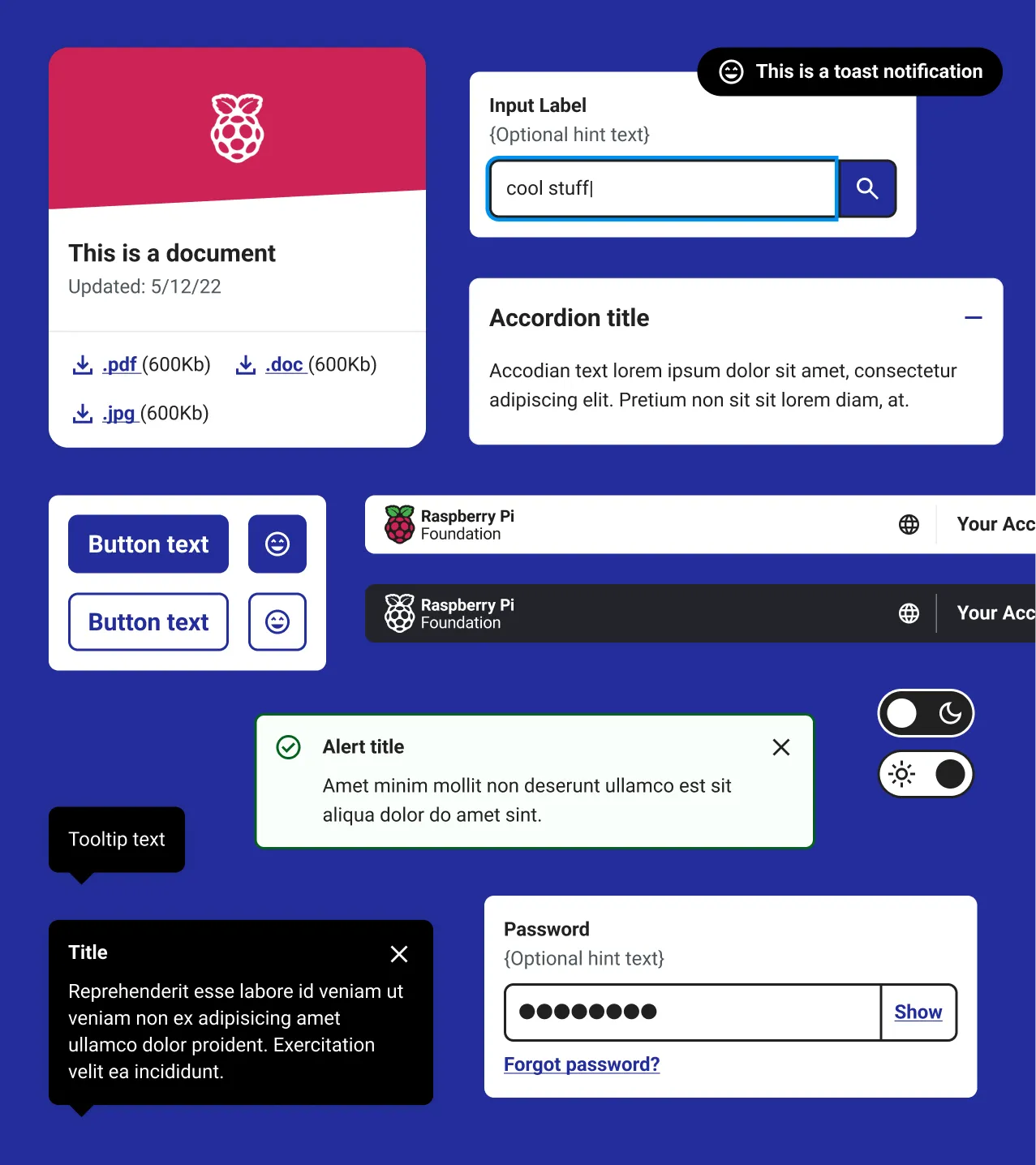
The first thing I did was establish styles for the foundational elements, spacing, typography, colour. Having consistent fundamentals made it much easier for designers and engineers working across multiple products.
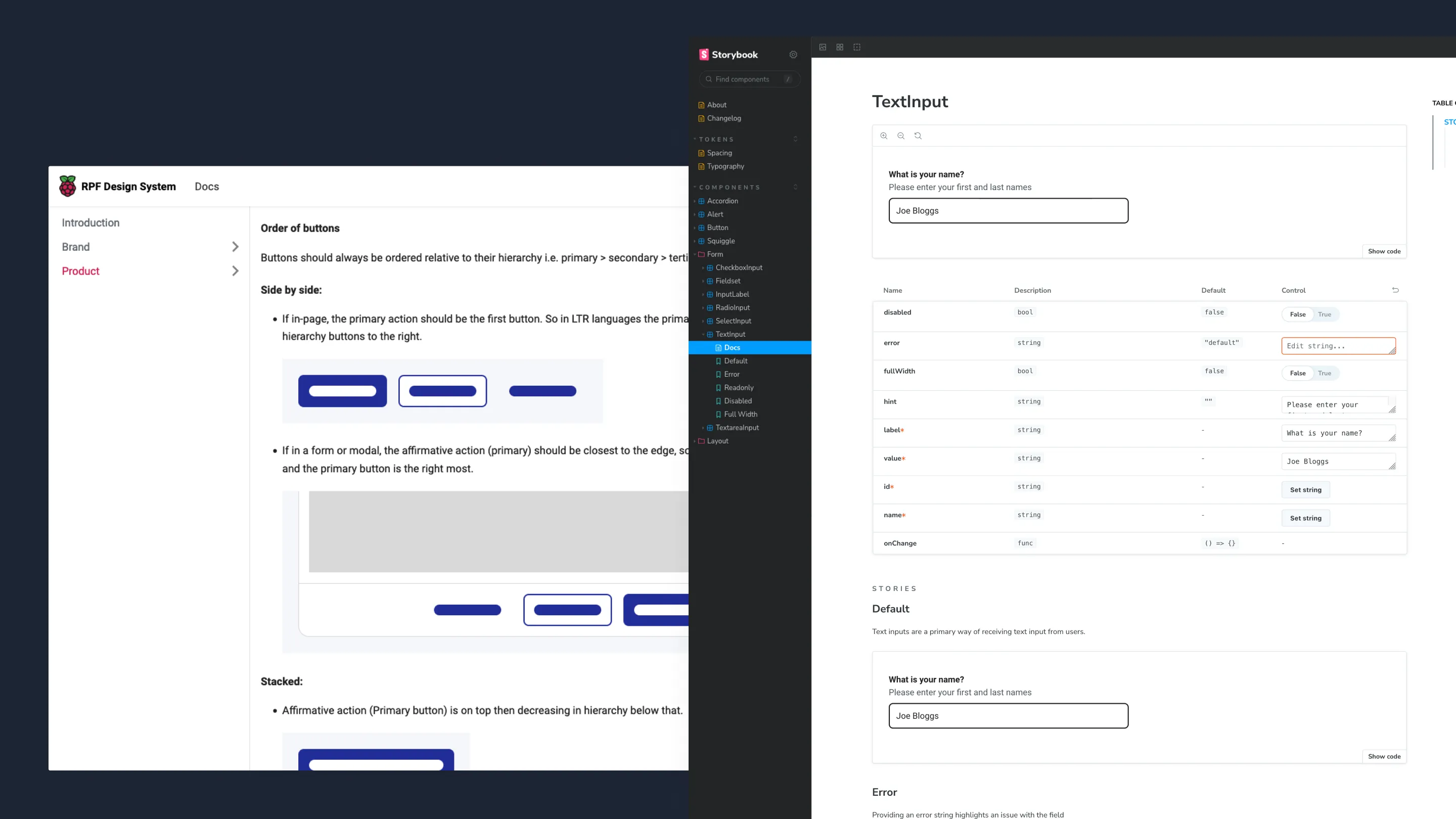
Component library
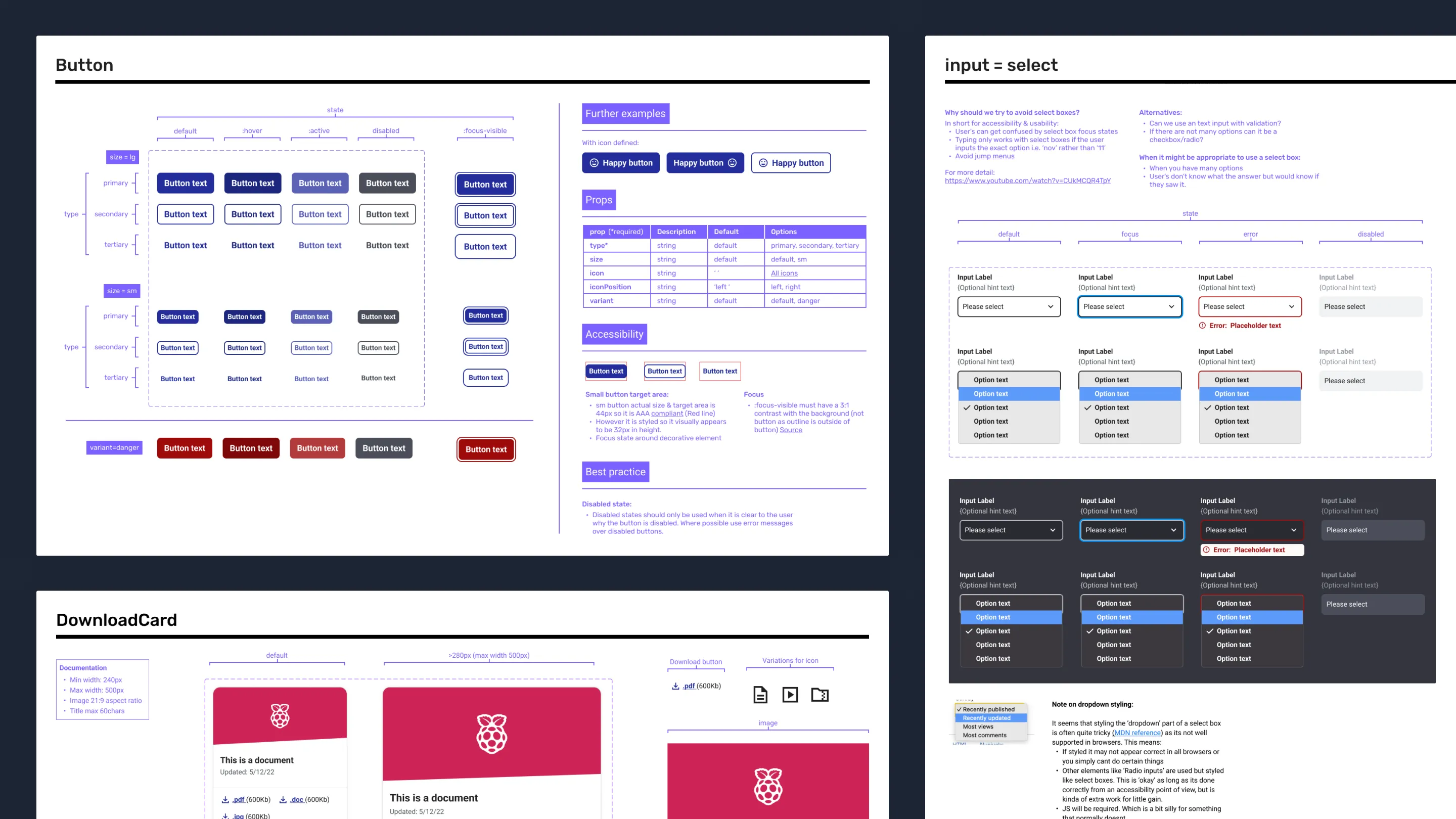
Using previous knowledge and experiences I established our documentation processes for our individual product and design system component libraries. This includes things like, outlining expected properties on components, examples of edge cases, code demos and CSS snippets when the desired outcomes cannot be expressed in Figma, links to relevant examples and further reading such as WCAG guidelines.
Documentation
We create usage documentation for the components as well as working with the engineers to create implementation guidelines. We use Storybook to showcase the components and Docusaurus as our main documentation tool for components and the design system as a whole.
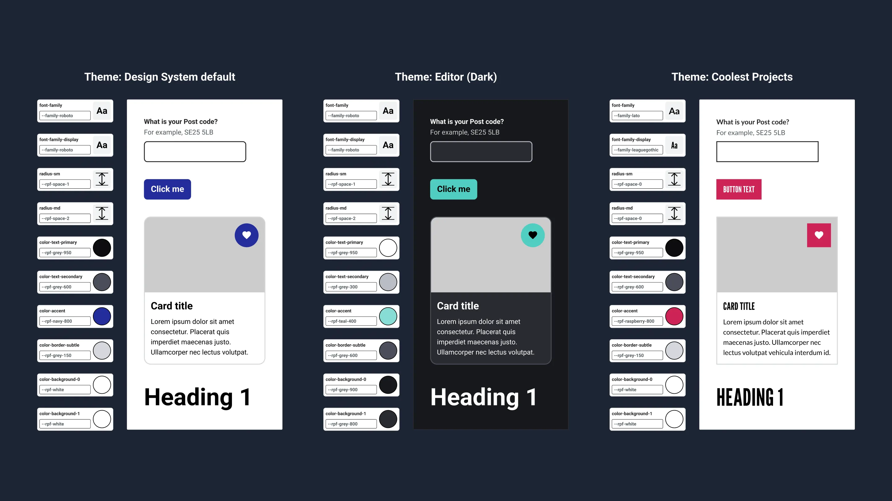
Design tokens
I advocated internally for a design token approach to styling by presenting research and demos to other designers and engineers. Once the idea had support and we agreed on an approach, we began implementing design tokens in the design system using Style Dictionary.
As there are many product brands, it’s important to ensure theming is done in a consistent way to provide a cohesive user experience. With Design Tokens, product teams just define their theme once and the design system will handle the rest. This will also vastly improve the engineering experience and reduce implementation errors, especially in the Code Editor where currently each component is styled twice, for light and dark mode.
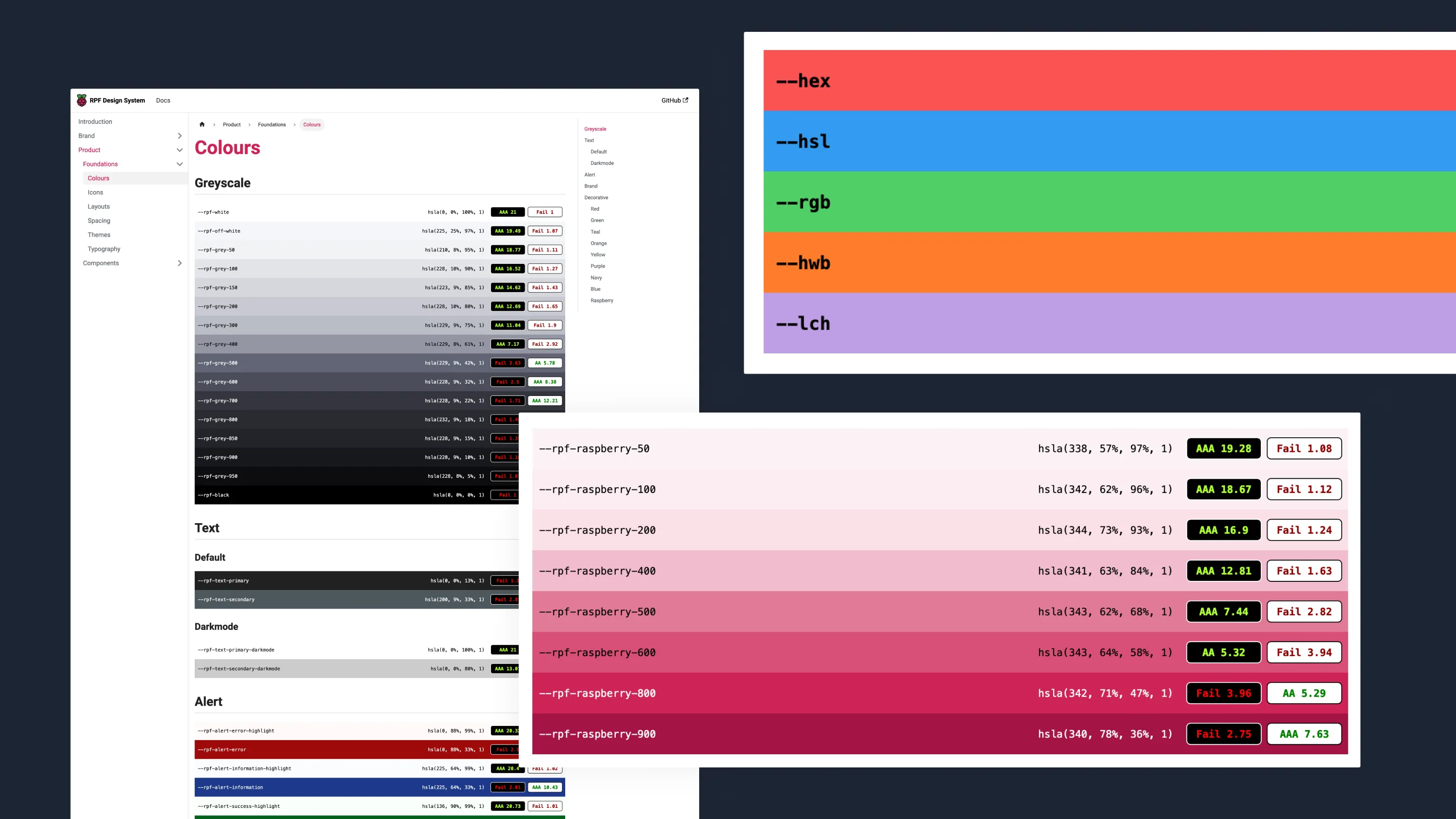
Colour Palette
To document our colours and make an easy reference for colour contrast, I built a Web Component that takes in a list of CSS custom properties and displays them in a colour palette with calculated contrast values and accessibility rating.
This is inspired by GitLab’s colour documentation however I have added features such as interactive controls, and support for many colour formats. Being a Web Component it can also be used anywhere. I have published this as an open source project and continue to work on it in my own time.