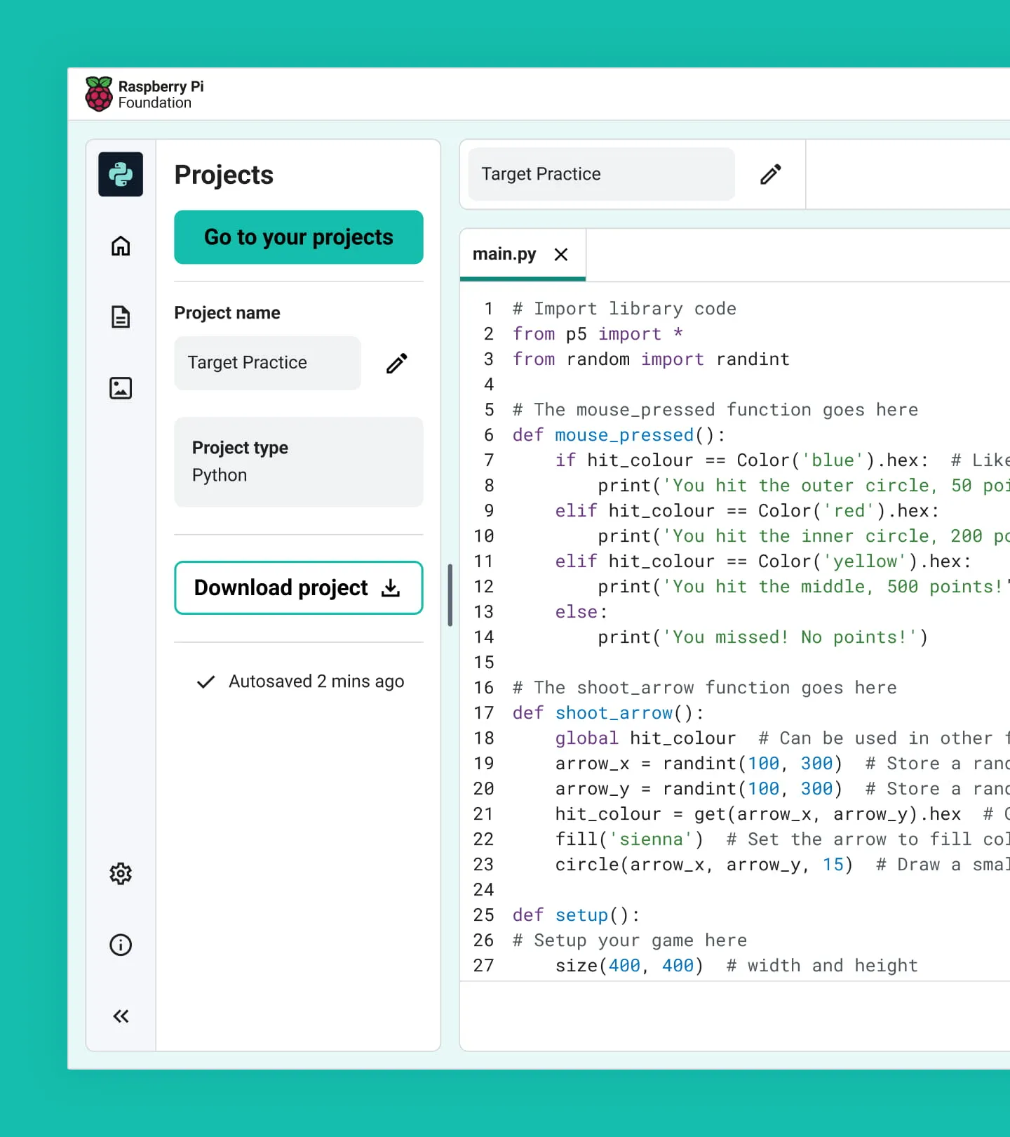
At the Raspberry Pi Foundation I have designed for and supported the development of a browser-based code editor. We wanted a first-party editor we could integrate into all of the Foundation’s products and ensure was suitable for young learners.
When I started working on the Code Editor there was already a working version that supported Python; it was, however, fairly limited in its responsiveness. I created designs which enabled HTML, CSS & JavaScript as supported languages as well as refactoring the Code Editor to support much smaller viewport sizes.
Flexible components and resizable panels
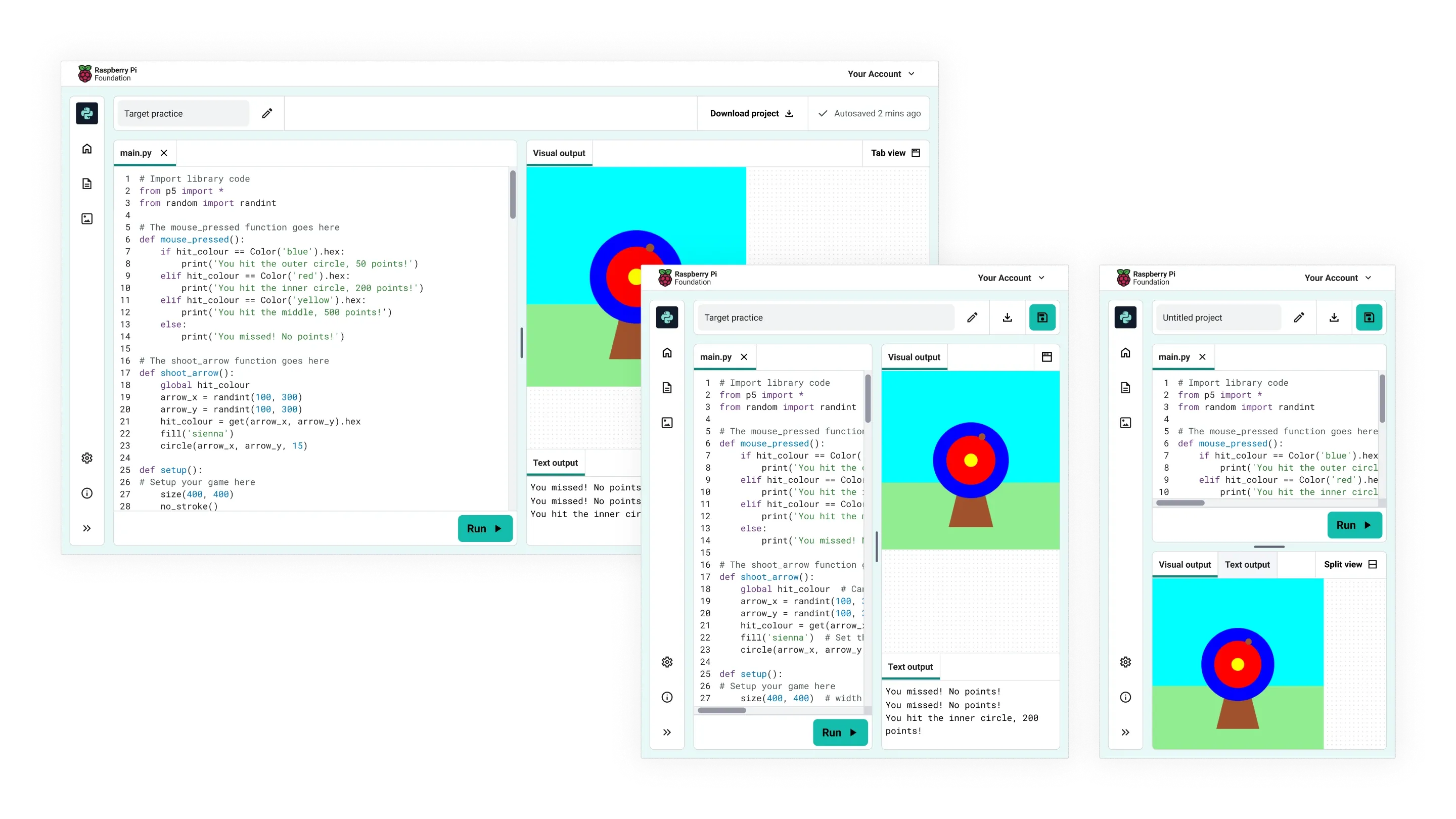
All of the components have been redesigned to be far more responsive. I encouraged the use of container queries (with fallbacks) in order to create flexible, context aware components.
This allowed us to support panel resizing, with the child components adjusting their layout depending on the panel size rather than the viewport. This also greatly reduced the work needed when it came to supporting smaller viewports for mobile users.
Support for mobile
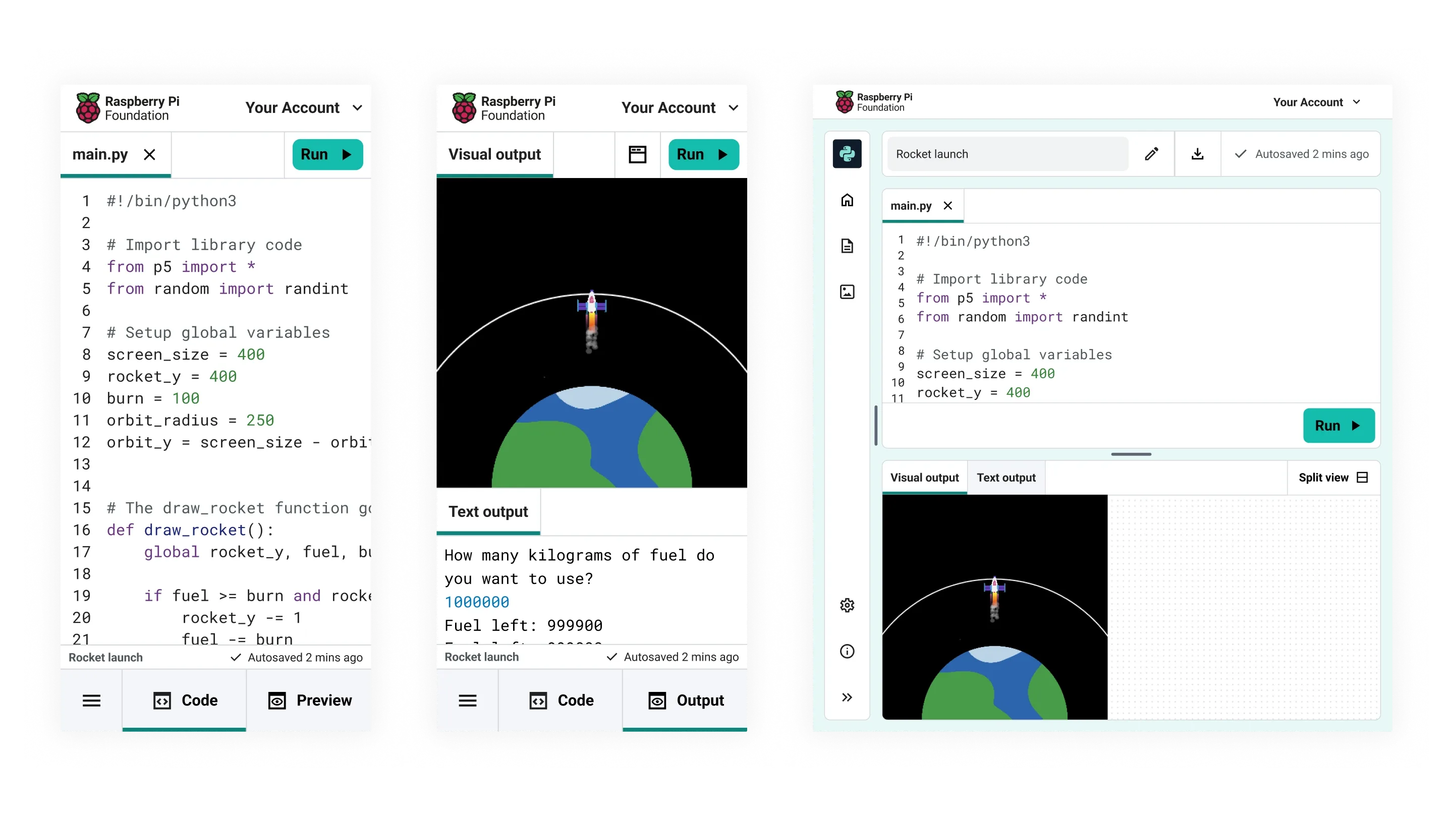
For small viewports we introduced a tabbed layout to the editor. This allows the user to view the input or output panel individually so each panel can take advantage of the full viewport. We also introduced stacked panels at intermediate viewports.
We found the tabbed approach to be a suitable compromise for smaller devices on which the Code Editor was previously unusable. We have also tried to compensate for this with automatic tab switching when suitable and expected by the user.
Component library
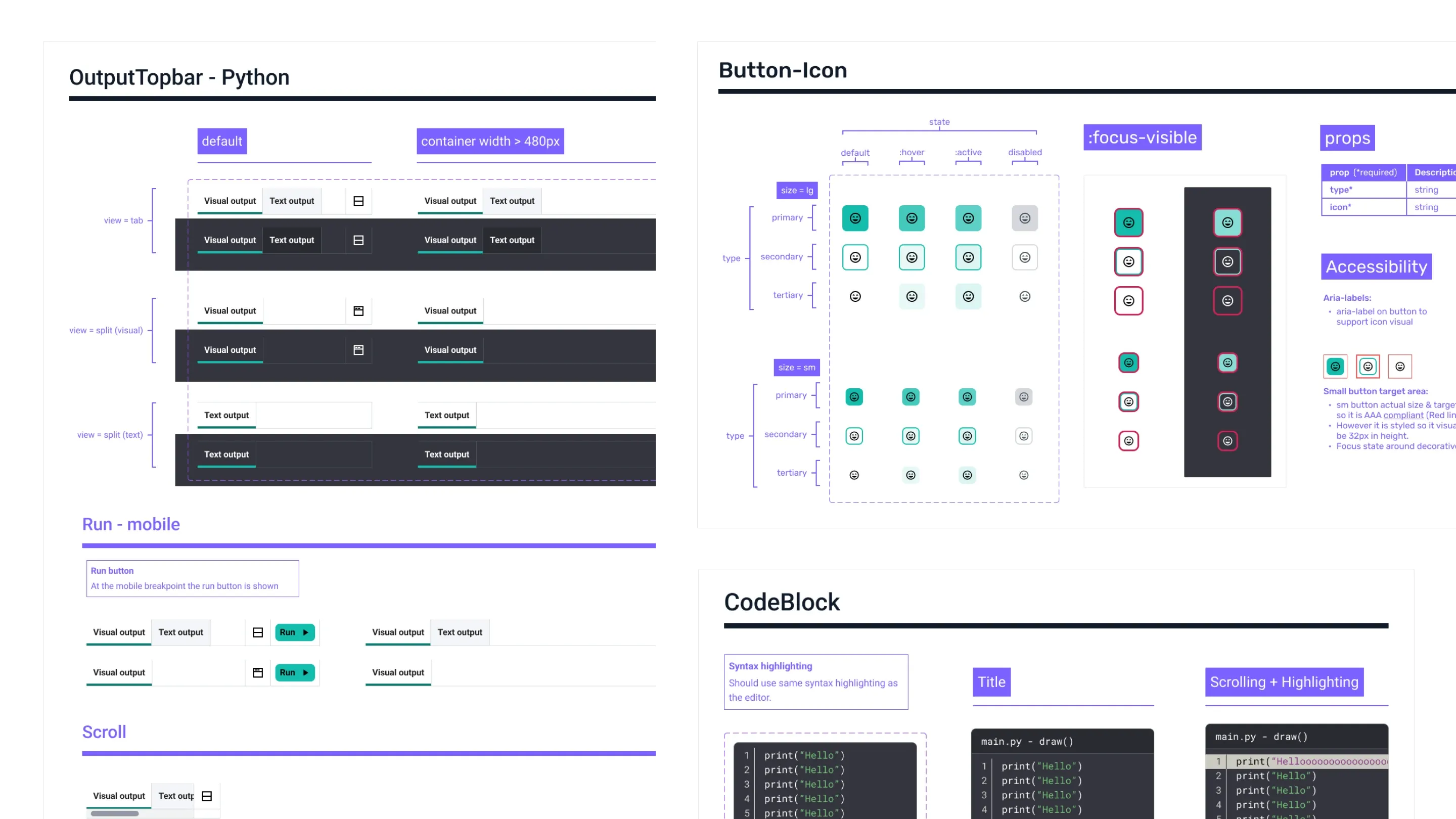
The designs for the Code Editor include a thoroughly documented component library. Using techniques I’ve outlined in the RPF Design System project. I work closely with developers to ensure that documentation is relevant and useful.
Sidebar system
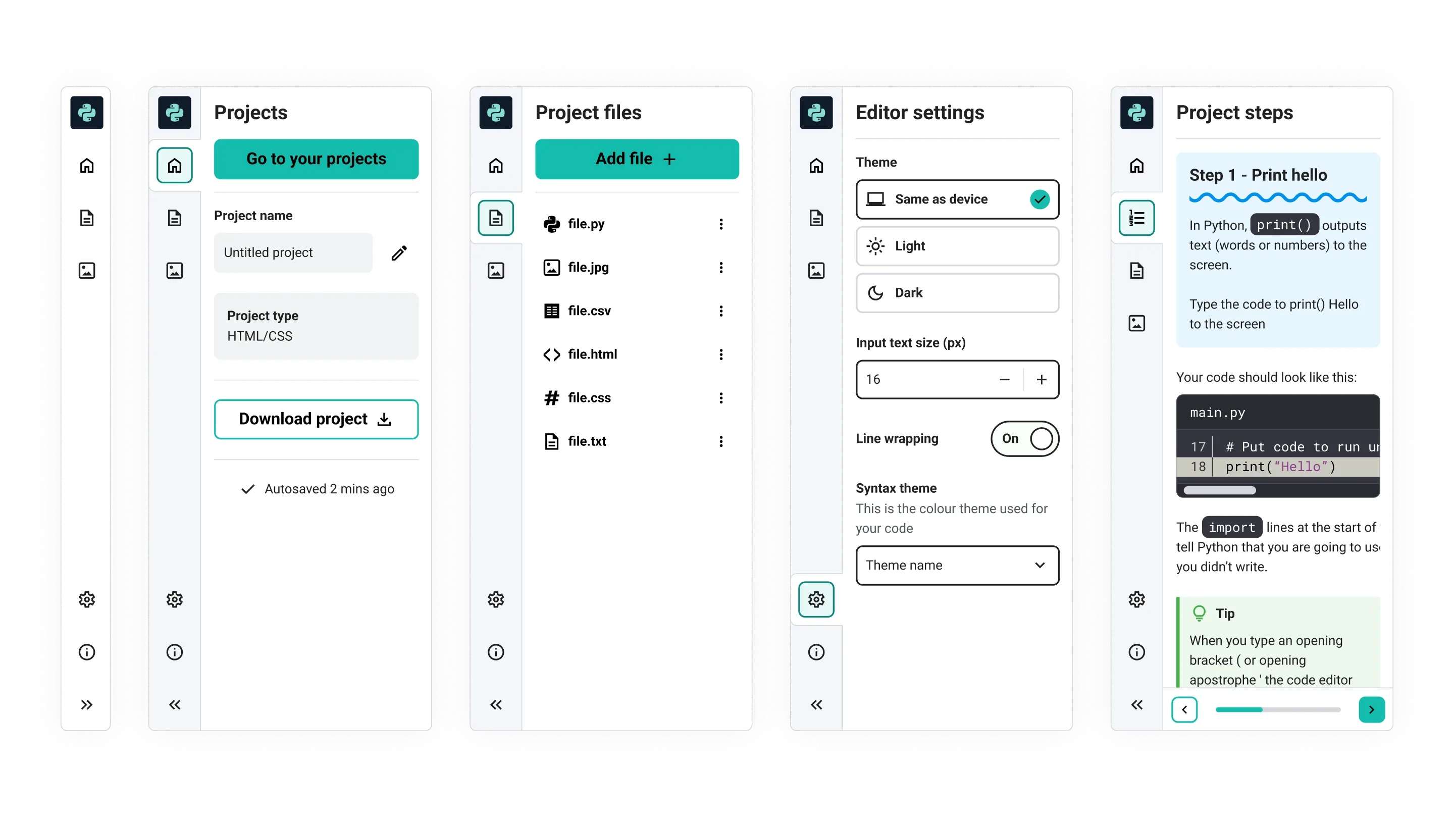
I designed a flexible sidebar for the Editor which allows for future functionality. This sidebar also gives the user the ability to collapse panels such as their ‘files’ when not in use, meaning they have more space dedicated to coding; this is particularly useful for small viewports.
Instructions integration - The problem
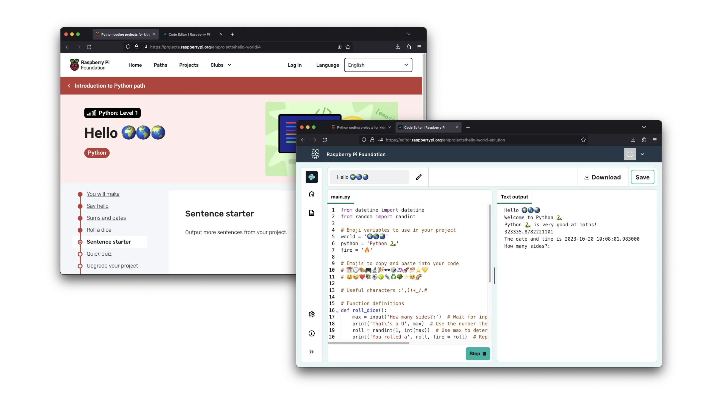
The Projects site at Raspberry Pi Foundation hosts hundreds of free coding projects for young learners. This is typically what users follow to make something when using the Code Editor. User testing highlighted issues with context switching when changing browser tabs between the Projects site instructions and the Code Editor.
Instructions integration - The solution
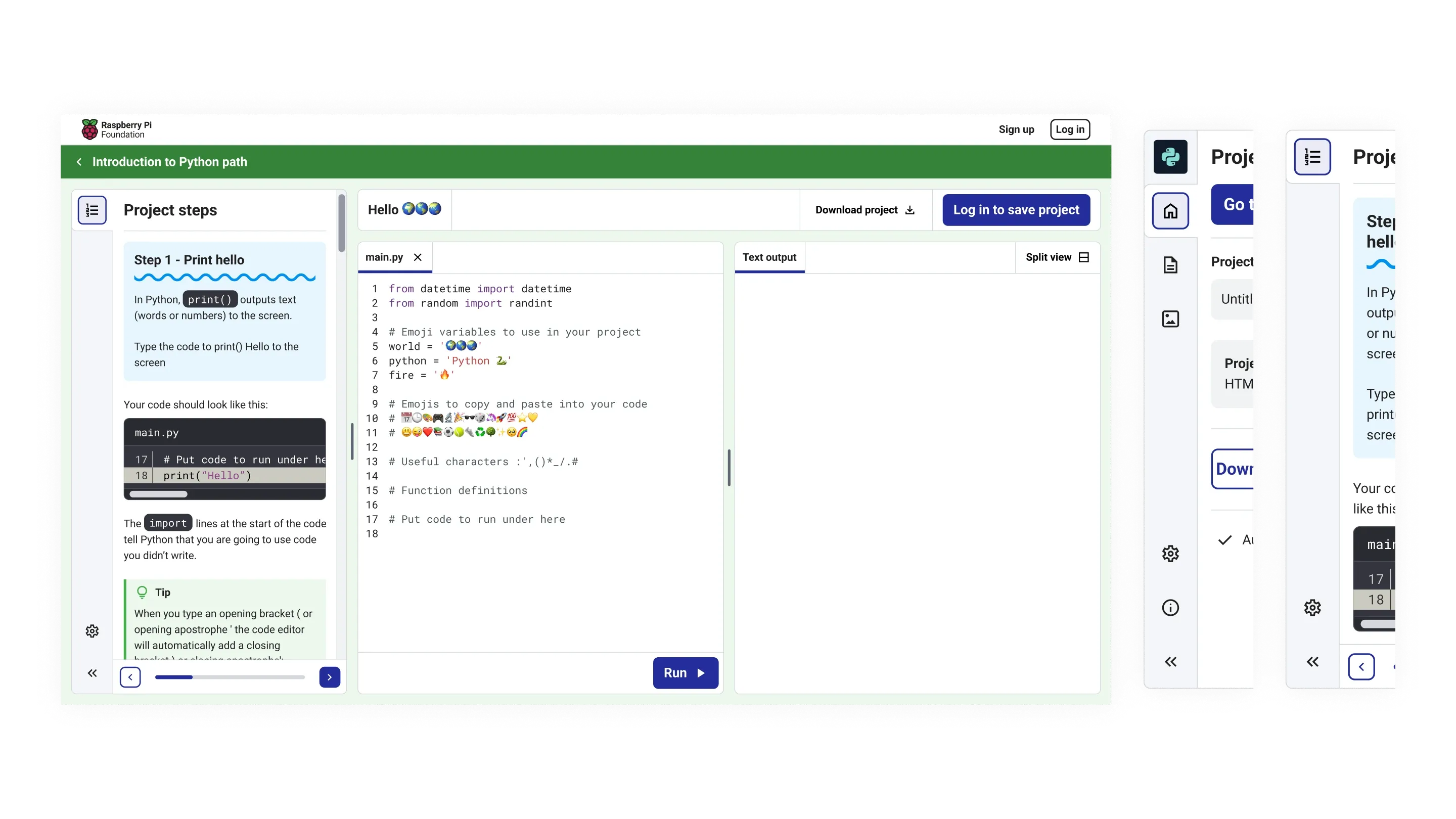
I designed a simplified experience by bringing the instructions into the sidebar in an embedded version of the Code Editor within the Projects site. The instructions were restyled and split into smaller chunks with the aim of making them easier to follow.
These new designs and further iterations of the sidebar result in reduced context switching for users and adds the ability to remove features that the user doesn’t need at this stage to avoid overwhelming them.
