The Raspberry Pi Foundation homepage had largely not been changed since 2021 when it split in two (rasberrypi.org / rasberrypi.com) The old site was largely out of date with the brand guidelines and lacked structure.
The new homepage (and ultimately full site) redesign aims to showcase the amazing work the Foundation does and help users find what they need.
UX review & stakeholder interviews
First we conducted a review of the current homepage to identify initial user experience concerns. The review as well as interviews with stakeholders helped to define the goals of the new homepage. We then created several block/wireframes to decide on what content and structure we wanted to test.
![Two views of a page, one showing a basic layout with blocks and titles (blockframe), the other with more detail but just showing the general structure of the page (wireframe).]](/_astro/review.DCL1lFLk_Z1zOKKe.webp)
Using the brand
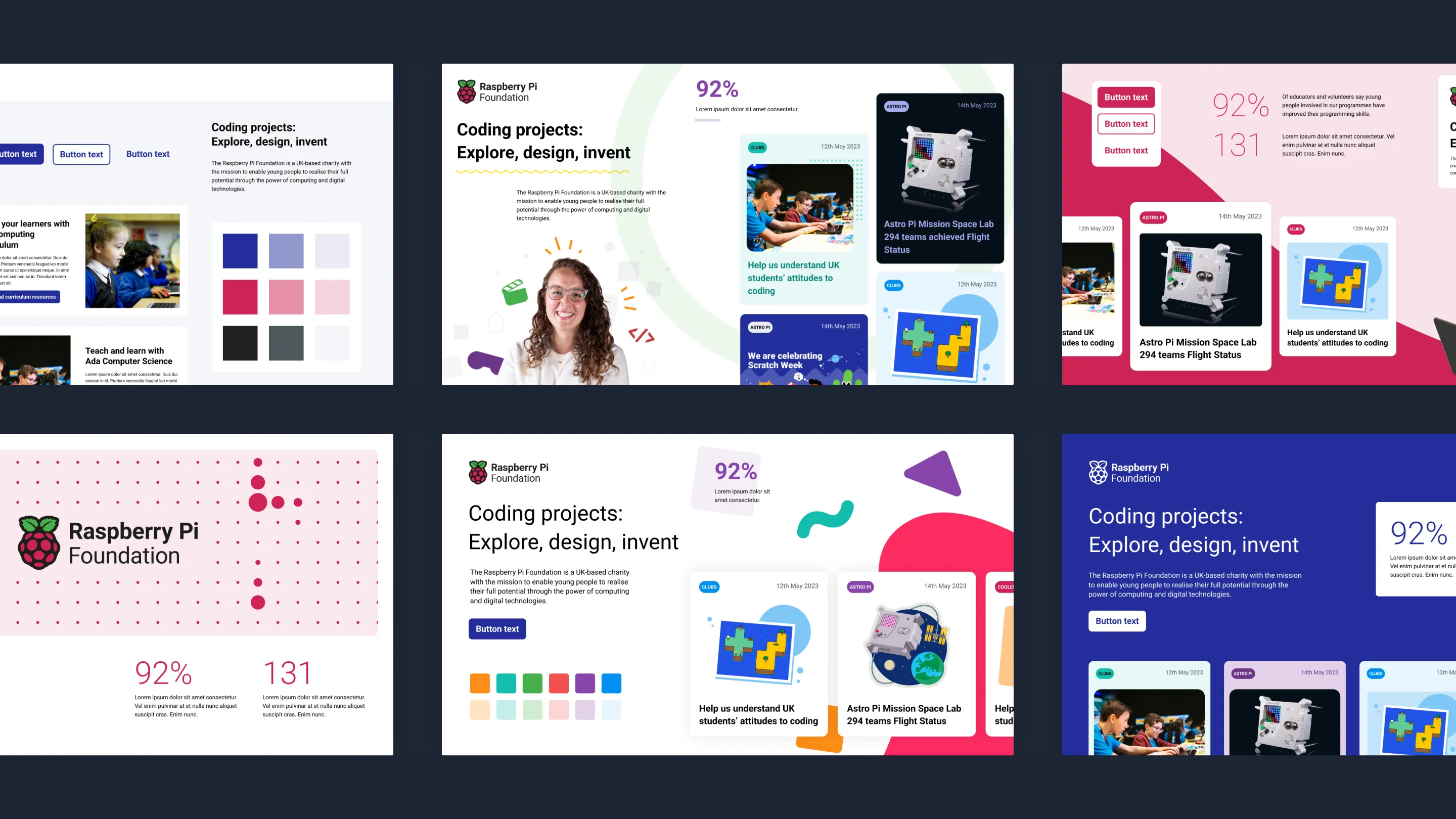
As we were reimagining how the Raspberry Pi Foundation brand presents itself in a digital environment I started by creating several style tiles as a way of quickly exploring different approaches and getting feedback from stakeholders.
Prototypes and user research
I created 3 different designs for the homepage prioritising different types of content and user needs. We then used these mockups to test with real users to decide which approach was most suitable.
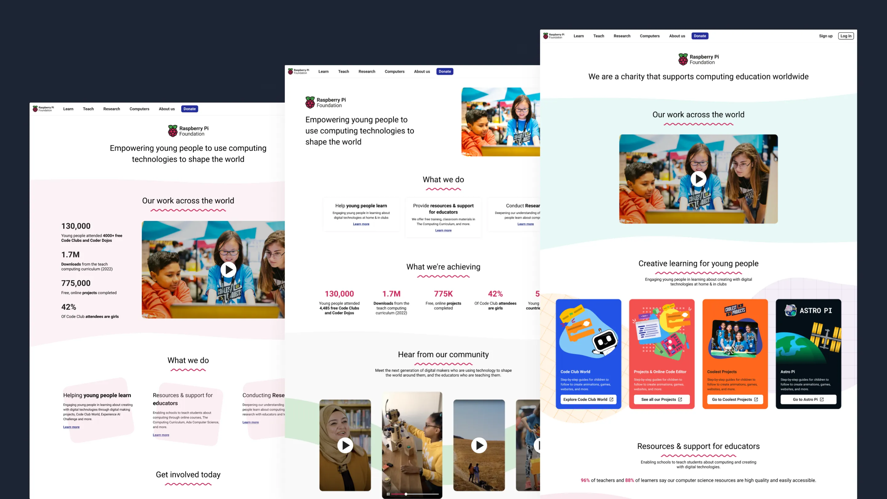
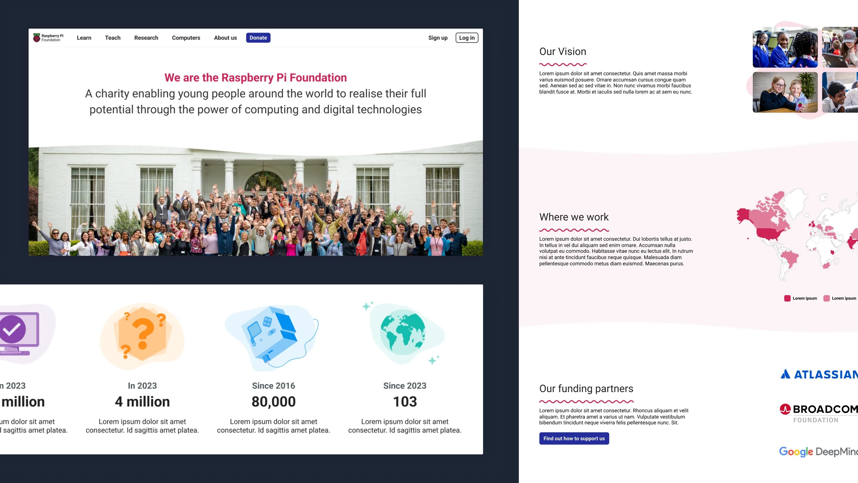
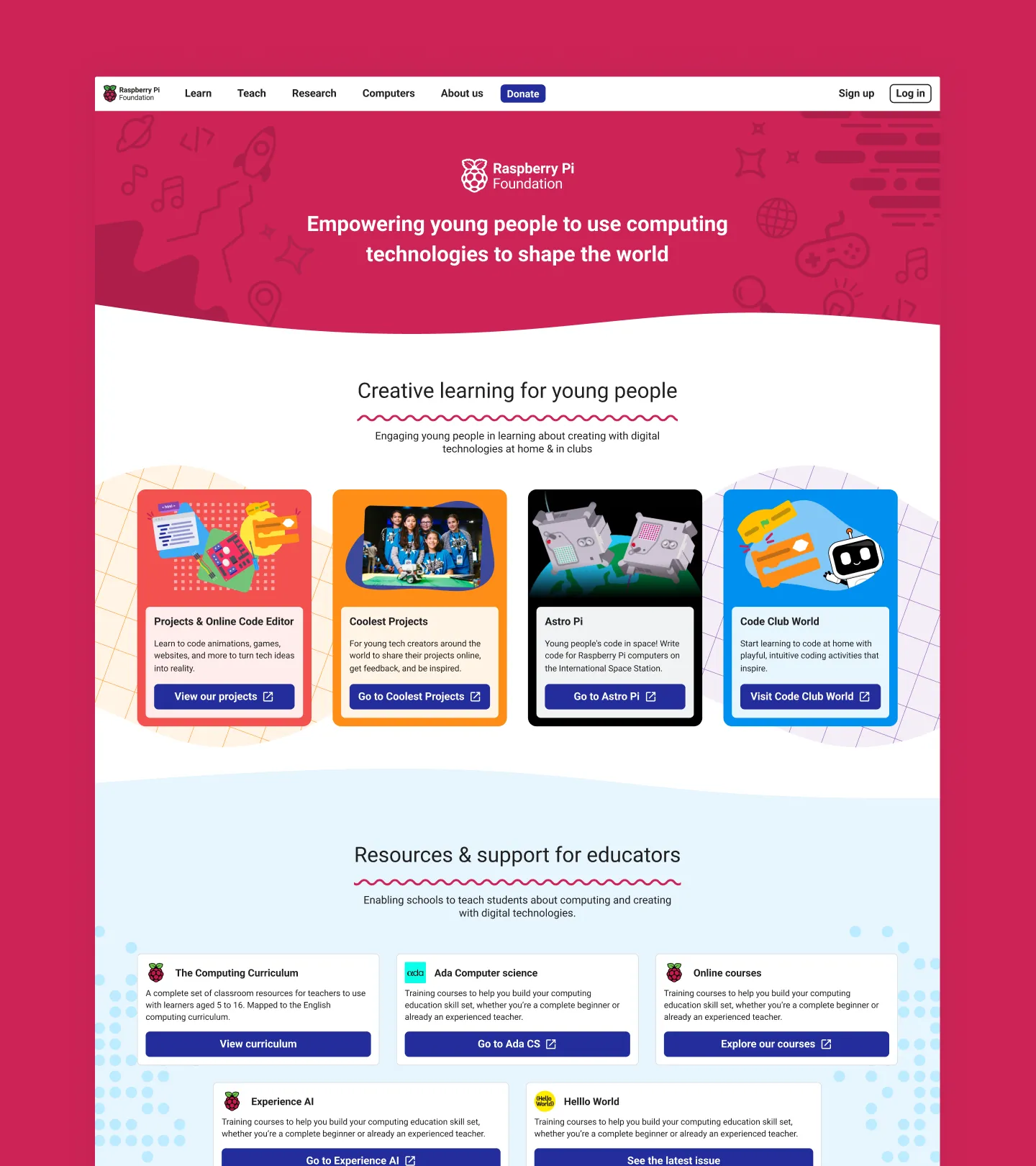
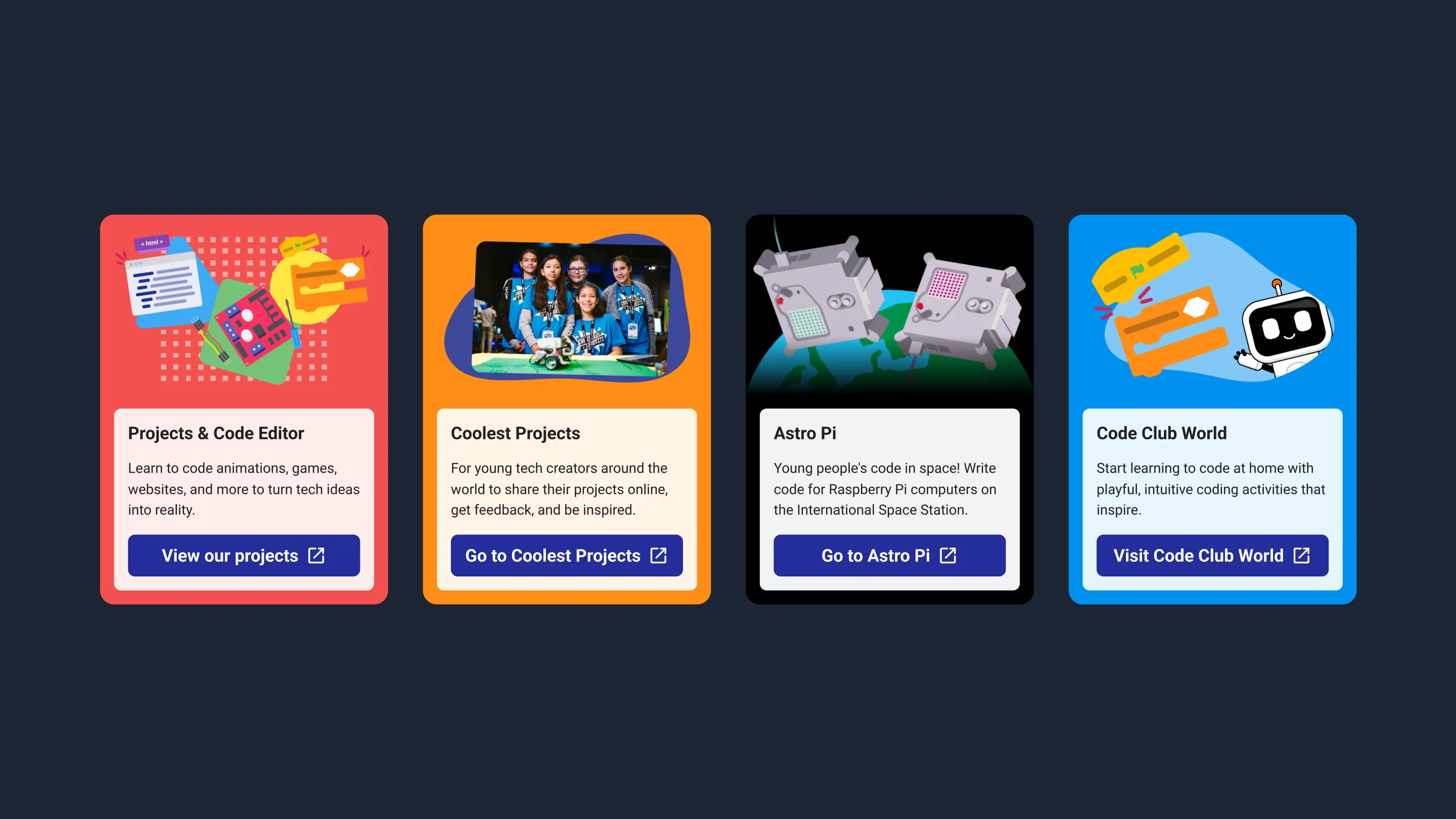
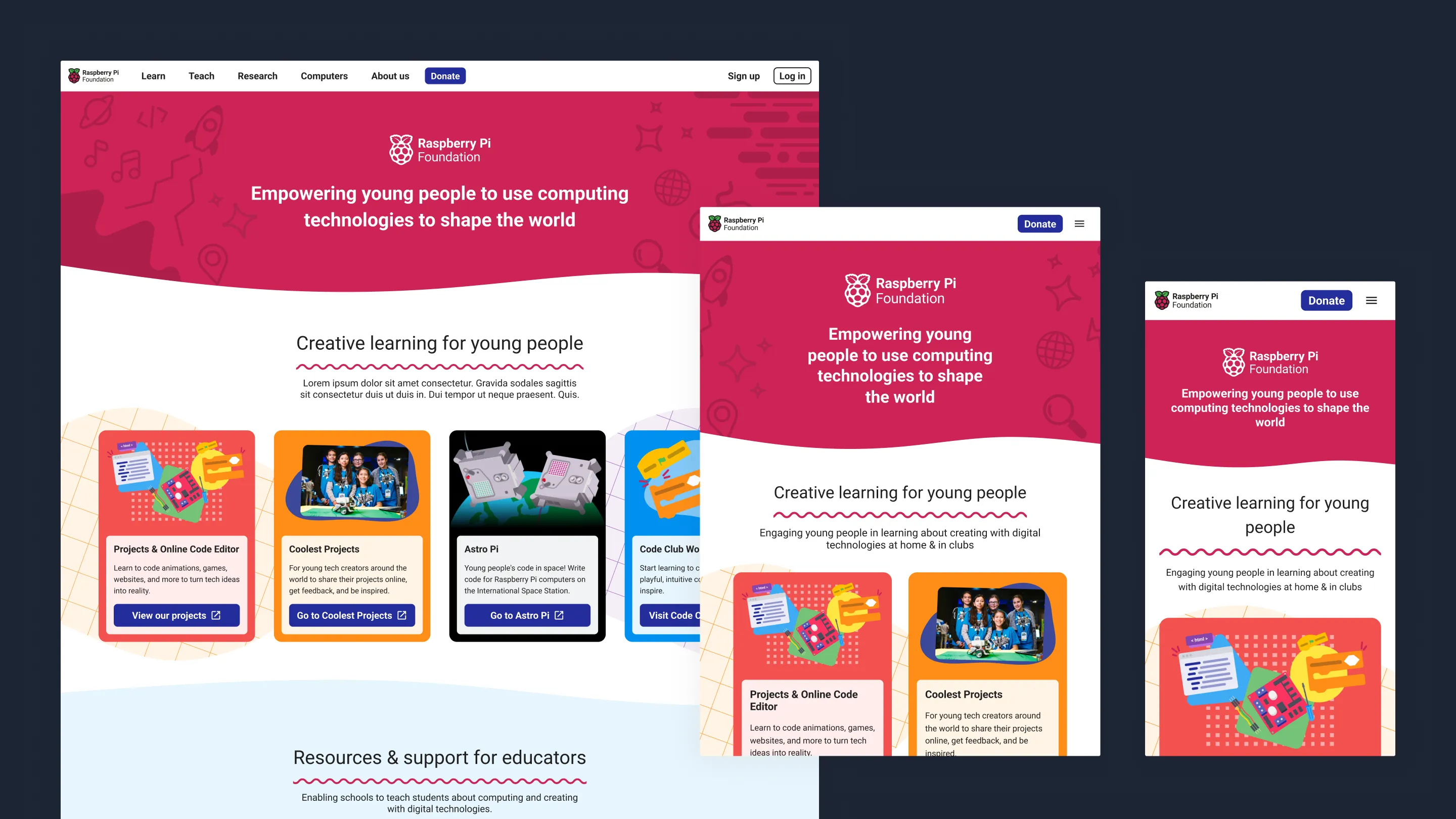
Product first
The insights showed that our users were using the homepage as a jumping off point, typically looking for a particular product, or wanted to understand what the Foundation does. This is why we decided on a product first approach.
Our users also disliked the use of statics on the homepage and expected those to be elsewhere. They also weren’t typically interested in the blog content. As a result these sections were removed or deprioritised.
A homepage for all
As with all our work, we ensured a great user experience regardless of the device being used. We also strive to meet the WCAG AAA standards wherever possible.
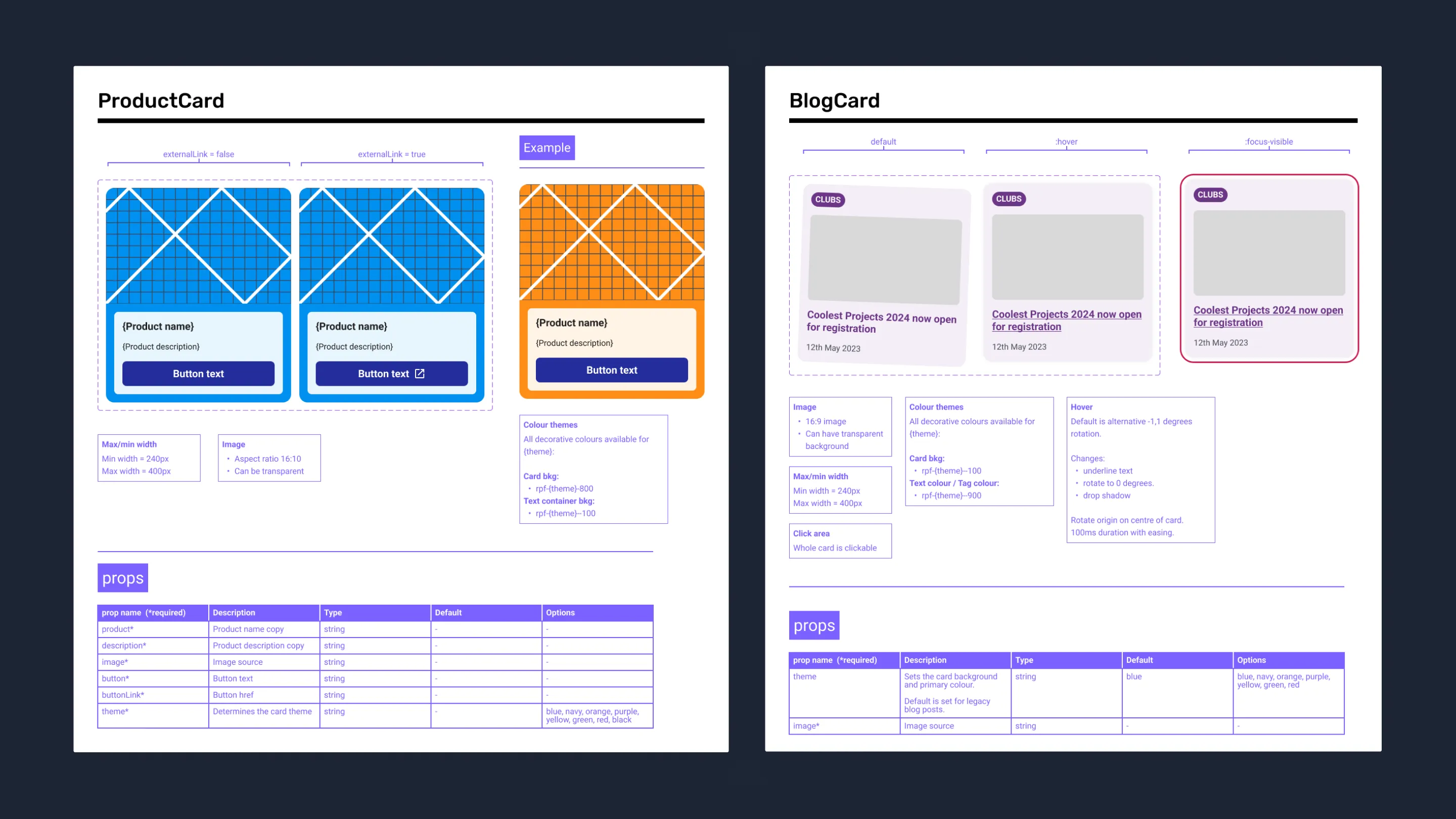
Components
The Figma component library for this project includes all relevant documentation for the Engineers including some additional notes such as details on what elements to surface in the CMS and how individual components can be customised. I talk about my approach to documentation more in the RPF Design System project.
The future
Following the work from the homepage, other pages are now being created that are in keeping with and expanding upon the new visual style, such as the about page.